New look!?!?! (v2)
web_design_is_my_passion.jpeg
It’s only been a month since I started this site and I changed the layout already.
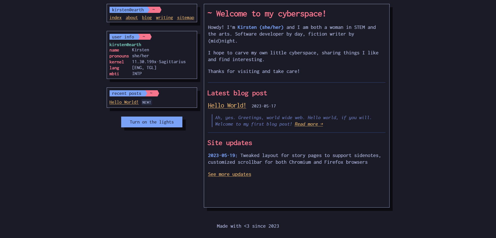
The previous layout had two columns: one 280-px sidebar and the main content column. Check out the old index here, courtesy of web.archive.org

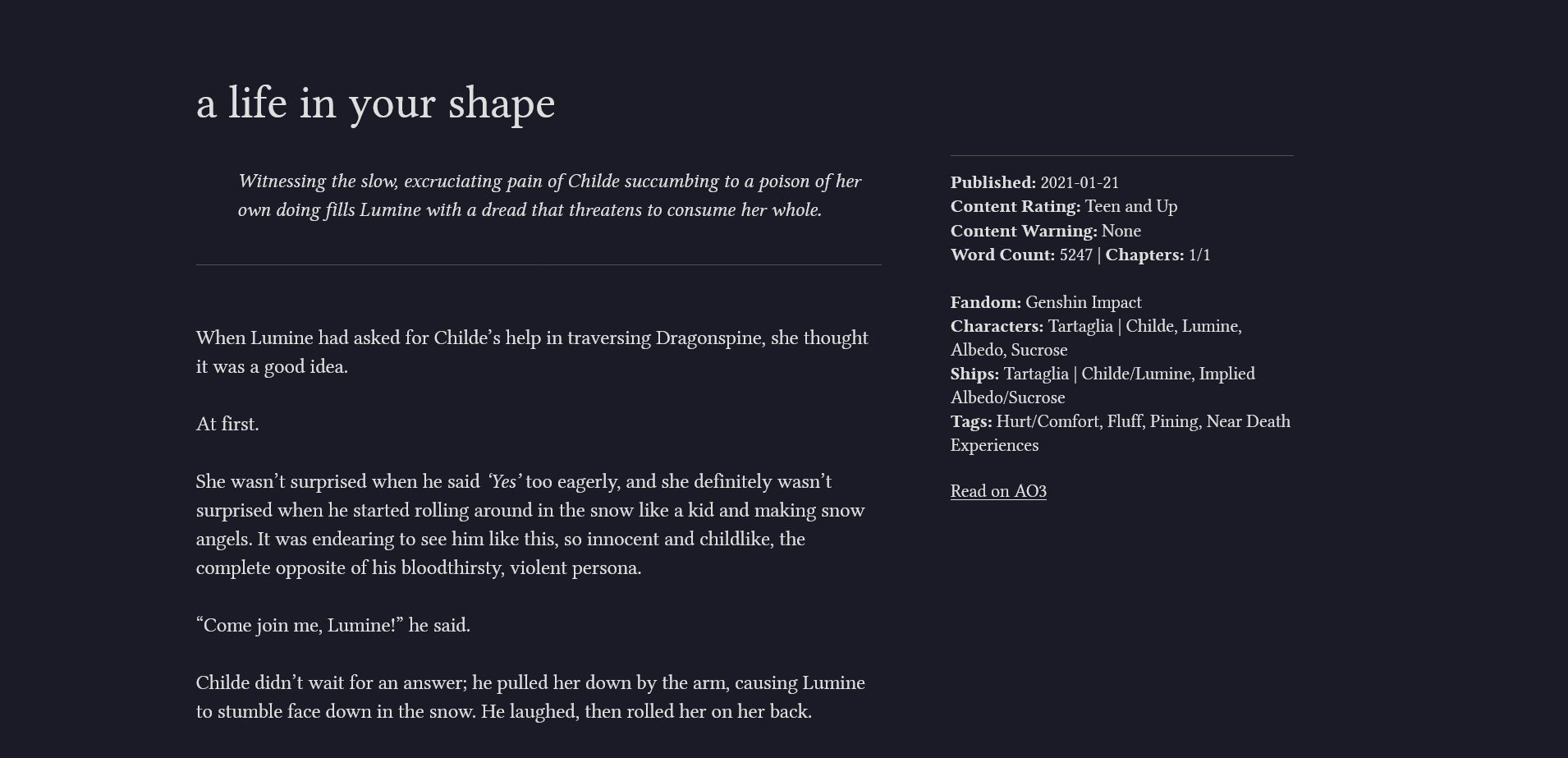
In the midst of porting my fics to Neocities, I wanted those pages to be suitable for long–form reading. I came across TufteCSS, which I found through Project Tara.[1] The layout was perfect for my needs, but I very quickly ran into a problem: there is now a huge clash between the main layout, and the Tufte layout.
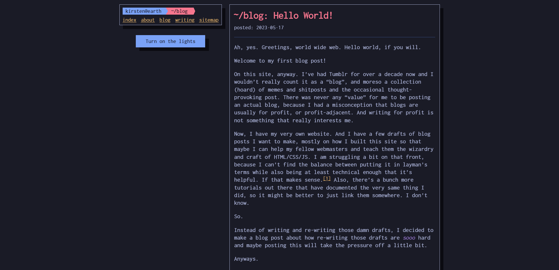
The blog page in the two column layout:

A fic page in the Tufte layout (page not uploaded as of yet):[2]

Sure, I don’t need to be too bothered about it; after all, not all personal websites have consistency between their pages, and sometimes, they’re even more interesting for it! But then I kept switching through my blog page, which had the two–column layout, and the fic pages with the one–column, and it just really, really bothered me that these two (technically) long–form content had different styles.[3]
I needed to redesign the entire site in such a way that it doesn’t lose its previous personality, while also having consistency between the long–form posts and everything else.
I nuked the old stylesheet and duplicated the modified Tufte over. A lot of the elements were changed, but the meat of it is essentially the same: one column to the left with space on the right for sidenotes/margin notes.[4]
Here we are.
I’m not totally satisfied with it, because now it looks too simple and minimalist and I’m sure there’s a balance in there somewhere between having an interesting design while still being responsive and consistent. But unfortunately I am not a designer![5]
There’s still a long way to go for this site. I haven’t completely archived all my fics here (I haven’t even uploaded them yet as of this blog post)[2:1]; I still have to figure out how to incorporate a Series, but most of it—one–shots and multi–chapters—are pretty much good to go. In essence, this site would be an archive of what I do/write, what I think, and what interests me. I’m sure there would be more design iterations of this site (*shudder*), but for now, this lends itself well to long–form reading, so here you go!
A re–host of the infamous My Immortal fanfiction. ↩︎
Jan 20, 2024 addendum: I’ve decided to separate my fic archive from this website, which you can browse here (NSFW warning!). ↩︎ ↩︎
I had previously reasoned that the blog and the story pages are completely different types of content, so the differing layouts might be acceptable, but in the end, I acquiesced. ↩︎
Pretty cool, eh? Try resizing the window! (Jan 20, 2024 addendum: No longer applicable in this version of the website due to the different layout. See how it looks in the original post here.) ↩︎
Speaking of designers, I found some really cool personal websites (mostly by graphic designers) and I think I will make a post about those, just to share them with you all! ↩︎